Lightning Fast Turnaround!
Walk down any condiment aisle and you’ll find dozens of hot sauce bottles competing for the same two feet of shelf space. Small-batch makers sit next to mass-market brands, and a shopper has maybe three seconds to make a call. In that window, the label isn’t decoration, it’s the entire sales pitch. And the one question it has to answer, fast, is: how hot is this, actually?
Before anyone tastes it, they’ve already formed an opinion. Colors, imagery, font choice, all of it registers before the cap comes off. A label that reads as “dangerously hot” to one person might read as “novelty gag gift” to another. Getting that signal right is what separates a label that moves product from one that collects dust.
“Spicy” is a physical sensation, but on a label it’s a design problem, you’re translating something the buyer hasn’t tasted yet into something they can see and immediately understand.
Color is the fastest signal on any label. It registers before imagery, before the name, before anything else. When it comes to heat, certain colors carry associations that are nearly universal across Western markets.
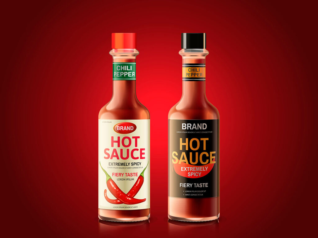
Red, orange, and yellow are the baseline vocabulary of hot sauce design. They map to flames, ripe chiles, and the visual shorthand for heat that most buyers carry around without thinking about it. Cholula uses warm terracotta red; Valentina pairs deep red with yellow accents. Both read as “spicy” before you’ve read a word.
Deep reds and black signal a different kind of heat, less “bright and fruity,” more “this will hurt you.” Products like Blair’s Death Sauce lean into near-total black with red accents to imply an intensity that crosses into warning territory. The palette does the threatening before the name does.
Green is the obvious choice for jalapeño and serrano sauces, it matches what’s in the bottle and signals freshness. The trade-off: green alone doesn’t read as hot. Cholula’s Green Pepper variety handles this by keeping the brand’s warm label architecture while shifting only the accent color. When you go non-red, the heat signal has to come from pepper imagery or the name, not the palette.
Color sets the temperature; imagery specifies it.
A font sets a mood before anyone reads a single word.
Jagged, cracked, or stamped lettering signals intensity before the buyer checks the heat rating. It works especially well for superhot sauces where the bottle itself is the first warning.
When flavor complexity is the selling point, citrus-forward sauces, fermented blends, a clean geometric sans-serif tells buyers this isn’t hot for the sake of hot.
Milder, fruit-based sauces sit in a different psychological category, table condiments rather than heat challenges. A loose, hand-lettered style reflects that positioning without apology.
Color, imagery, and typography should all point to the same conclusion. If the name promises danger but the design looks like a farmers market stall, buyers won’t know what to make of the bottle, and confused buyers put it back.
A beautiful label solves nothing if it peels on first use. Hot sauce is genuinely hard on labels: the high vinegar content is acidic, and the oils in the sauce smudge and lift standard paper stock. Both problems get worse once the bottle starts living in a refrigerator.
For hot sauce, vinyl with a protective laminate is the only material worth considering. Vinyl is waterproof and oil-resistant, it holds through refrigerator storage, messy hands at a cookout, and the condensation that forms when a cold bottle hits warm air.
Matte laminate reads cleaner and more premium on a retail shelf; gloss laminate offers better spill resistance and makes pigment-heavy colors hit harder. Either choice also matters for shipping: labels on bottles crossing temperature zones can bubble or lift at the edges, a problem printers call “flagging”, if the adhesive isn’t rated for that kind of thermal cycling.
White or clear vinyl with a matte or gloss laminate is the industry standard. It holds up to refrigeration, condensation, and the acidity inside the bottle. Paper labels fail in this environment, the moisture and vinegar cause peeling and discoloration, usually within weeks of regular use.
Not legally required, but worth including. A Scoville number or heat scale helps buyers self-select, the person hunting for 500,000 SHU finds it immediately, and the person who doesn’t gets a clear heads-up. Dedicated chili-heads track ratings across brands, so putting that number front and center makes your sauce part of that conversation.
Yes, and it works well when the sauce color is part of the appeal, a deep red habanero or a bright orange mango blend can sell itself through the glass. The constraint is contrast: text printed directly on clear film can disappear against a dark sauce. White ink backing behind logos and text is the standard fix; it gives the design a foundation without covering the bottle.
The standard 5oz Woozy bottle, the tall, tapered shape most craft hot sauces ship in, typically takes a label between 3×5 and 4×5 inches. Some producers go narrower or taller depending on what the design calls for. Die-cut shapes (ovals, irregular outlines, neck wraps) are printed at comparable cost now, which is why you see fewer plain rectangles on independent brands.
Ask your printer specifically about UV-stable inks and a UV laminate overcoat, not every print run includes them by default, and some vendors charge extra. Direct sun degrades dye-based inks in a matter of weeks. Hot sauce moves slowly at some shops and can sit in a window for months. UV laminate typically adds a few cents per label but holds color accurately through a year or more of window exposure.
Depends on your customer. A small-batch, farm-grown pepper sauce aimed at farmers market shoppers reads better with earthy tones, hand-drawn type, and minimal clutter. A sauce marketed to the competitive heat crowd, people tracking Scoville counts and chasing challenge runs, tends toward skull imagery, aggressive color contrasts, and heavy sans-serif fonts. Neither direction is wrong; the mistake is mixing signals (a rustic, handmade aesthetic on a sauce called “Inferno Death Blast,” for instance).
Finish choices do more work than most people expect. Spot UV coating, a glossy layer applied only to specific elements like the logo, creates tactile contrast that makes a shelf-browser reach for the bottle. Metallic foil stamping on a key design element catches light from across an aisle. A die-cut shape, anything other than a rectangle, breaks the visual grid entirely. These aren’t cheap additions, but the ROI is measurable: a shopper who picks up your bottle is already halfway to buying it.
Yes, and it’s non-negotiable. The FDA requires all retail food products to carry an ingredient list in descending order by weight, a net weight statement, and the name and address of the manufacturer or distributor. If your sauce makes any nutrient-related claim, “low sodium,” “no added sugar”, a full Nutrition Facts panel is required as well. The FDA’s full food labeling guidance is at fda.gov. Sort this out before you go to print; reprinting 2,000 labels because of a compliance error is an expensive lesson.
Your hot sauce label does several things at once: it identifies the product, signals the flavor profile, and tells a potential buyer in under three seconds whether this sauce was made for them. Color, typography, and imagery aren’t decoration, they’re the shorthand your customer reads before they touch the bottle. Get those three elements working together around a coherent brand identity, and the label sells the sauce before anyone reads a word of copy.
Want a label that’s as bold as the sauce inside the bottle? We handle design, material selection, and custom finishes, so your product looks the part on a crowded shelf.
|
Uploaded
Failed
|
 |